About
Creating an intuitive user experience brings many challenges, especially for the Saginaw Public Library (SPL), which has served the city of Saginaw, Texas for over three decades. This passion project focused on putting the user at the center of the experience. We began by identifying the library users’ pain points through observation and interviews. Our findings led to a rebrand of Saginaw’s identity, a revised wayfinding system, and a redesigned catalog interface.
Services
Brand Identity
Wayfinding
UX/UI
Industry
Information Services
Location
Saginaw, Texas
Type
Non-Commercial
Real People, Real Problems!
Over one week, we interviewed five patrons of different ages and backgrounds to understand their personal experiences. We asked questions like: What areas of the library do you use the most, and what has been your experience? How long did it take to find an item using the catalog system? What is your experience checking out and returning items? If you could improve one area, what would it be? These in-person interviews, combined with our initial research, helped us create personas that highlighted the challenges users face.

Celia (69)
Grandma
“My eyesight is going bad, so I would love to have bigger and brighter signs that clearly show all sections.”

Riley (7)
2nd Grader
“The catalog can be confusing. It uses abbreviations I don’t understand. Also, the book naming doesn’t always match the shelves.”

Amanda (28)
Post-grad Student
“The library is usually noisy as there are kids running around in the shared spaces. I am sometimes unable to find seating and the study rooms are typically full.”
Crafting a Proposition
Based on our research, interviews, and observations, we identified several issues that hindered the user experience. SPL's branding was outdated and inconsistent across print and digital interfaces. Wayfinding was particularly problematic due to this inconsistency. The catalog system, which patrons use to locate books, was complex and confusing. Additionally, users frequently complained about noise and seating arrangements. Our proposal included a revamped brand identity with interactive wayfinding, a dedicated catalog system, and a reversed floor layout to separate high traffic from quiet areas
Welcoming the Community
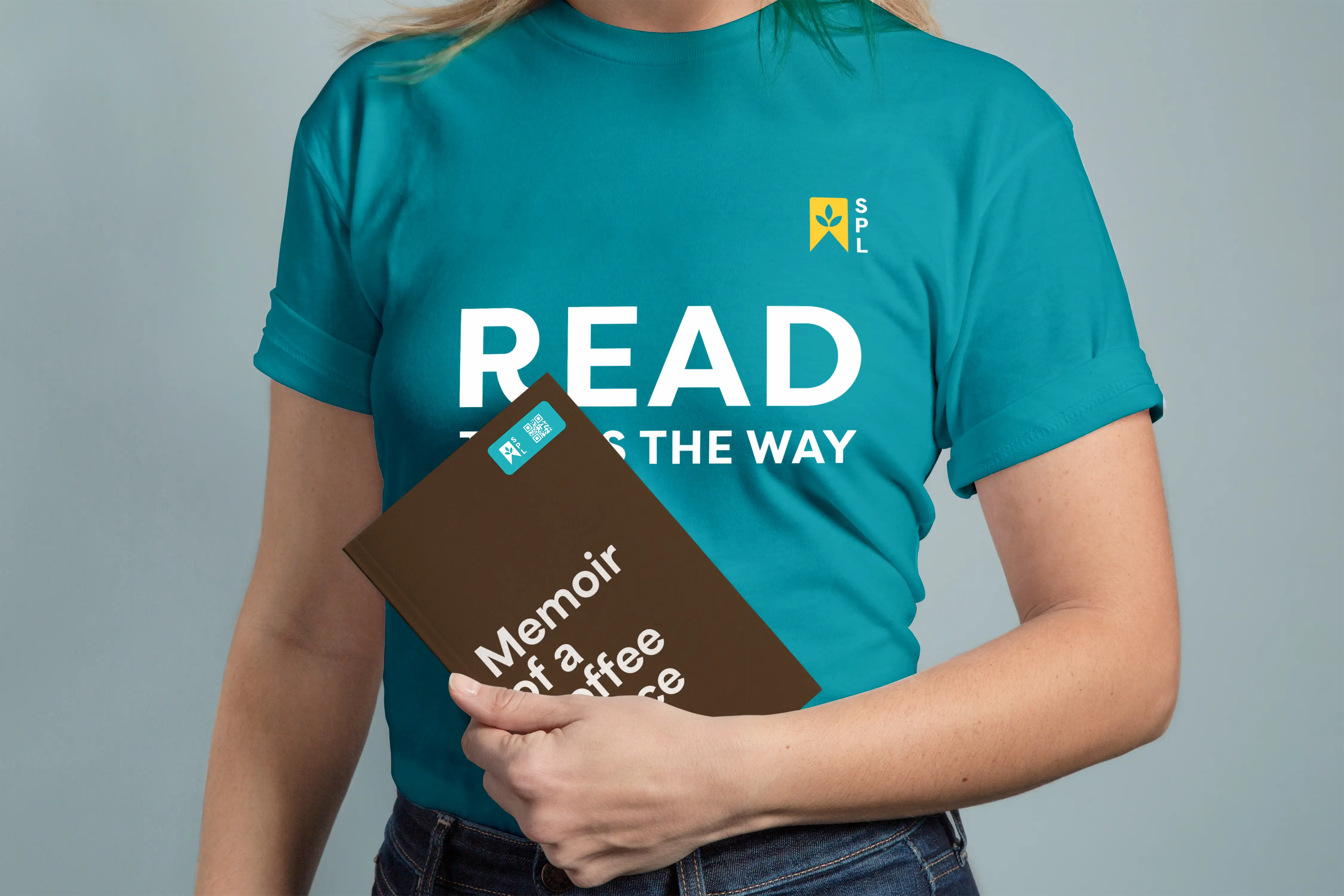
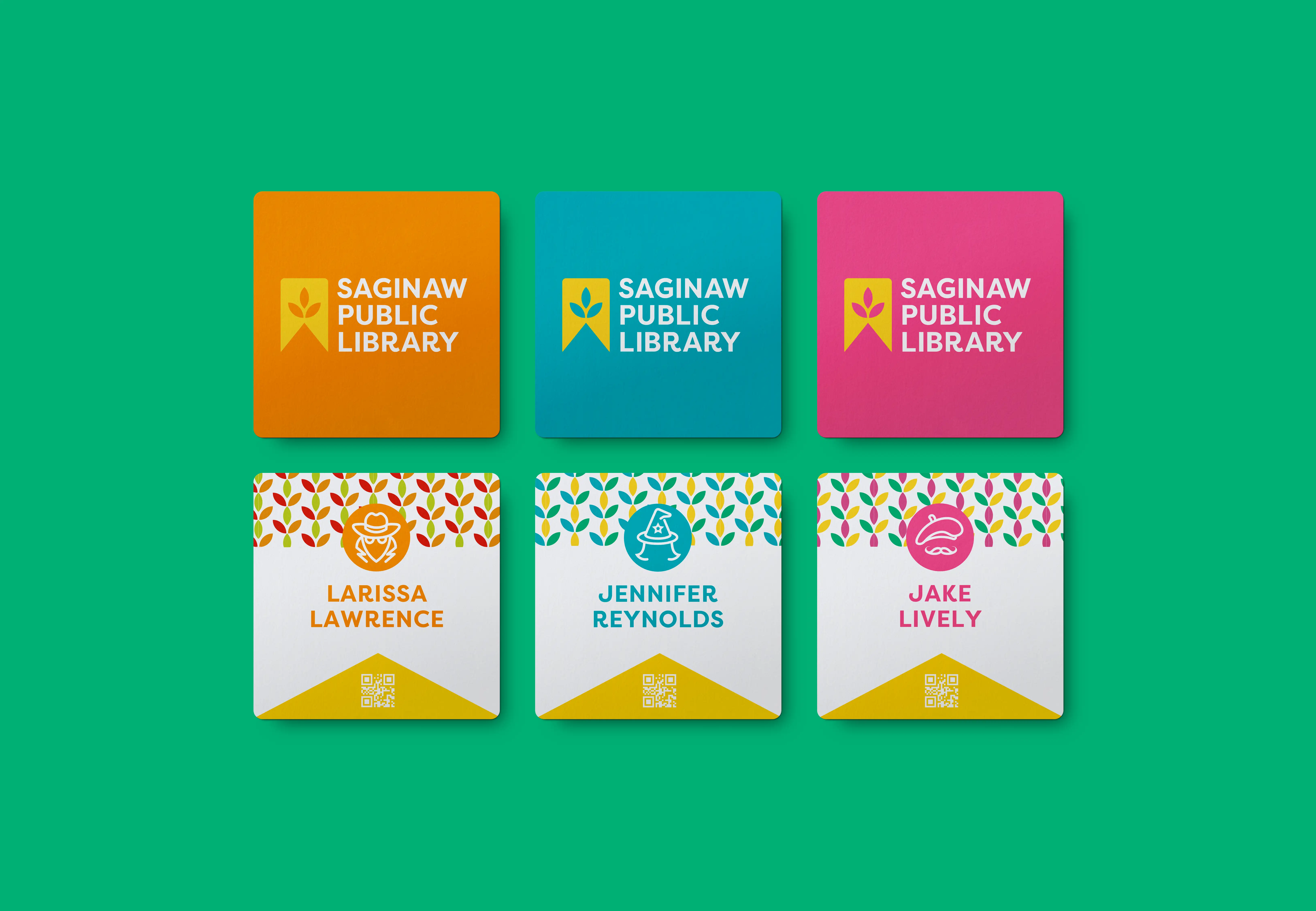
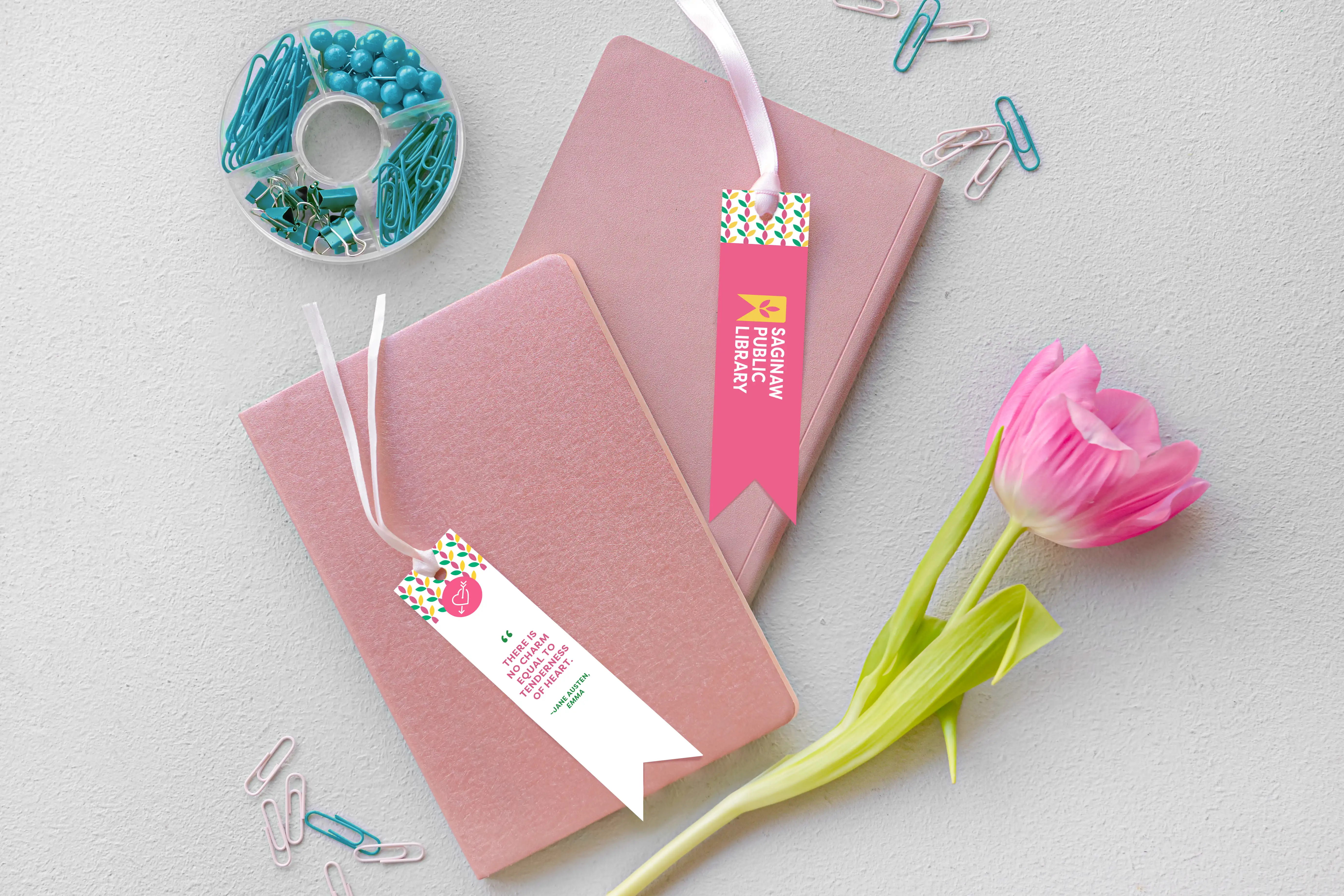
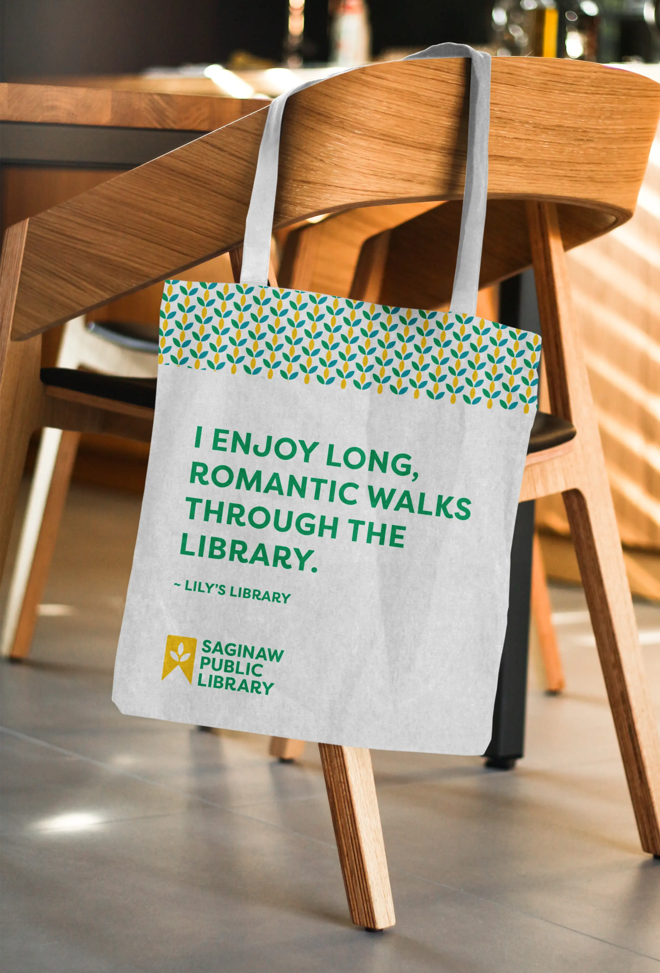
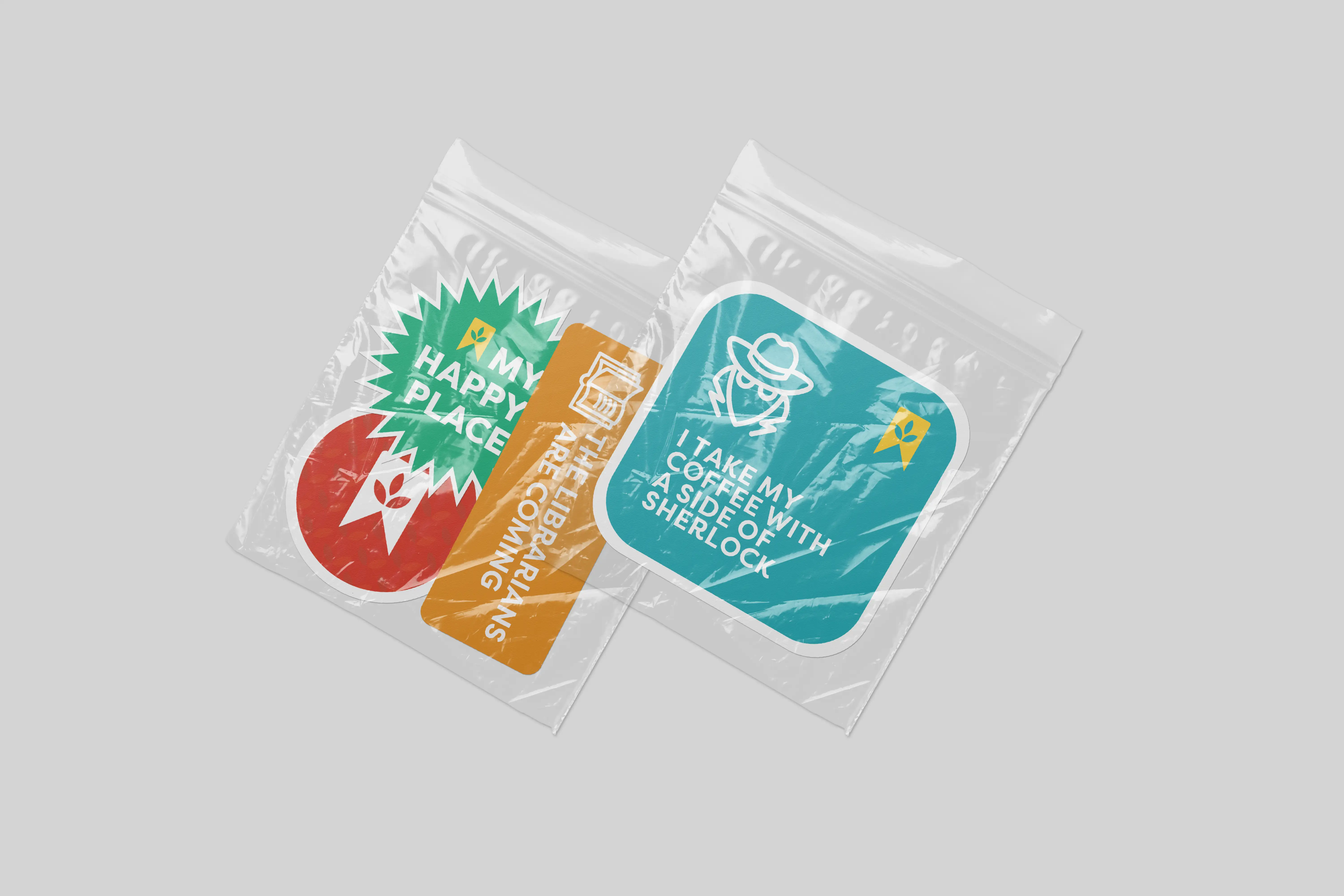
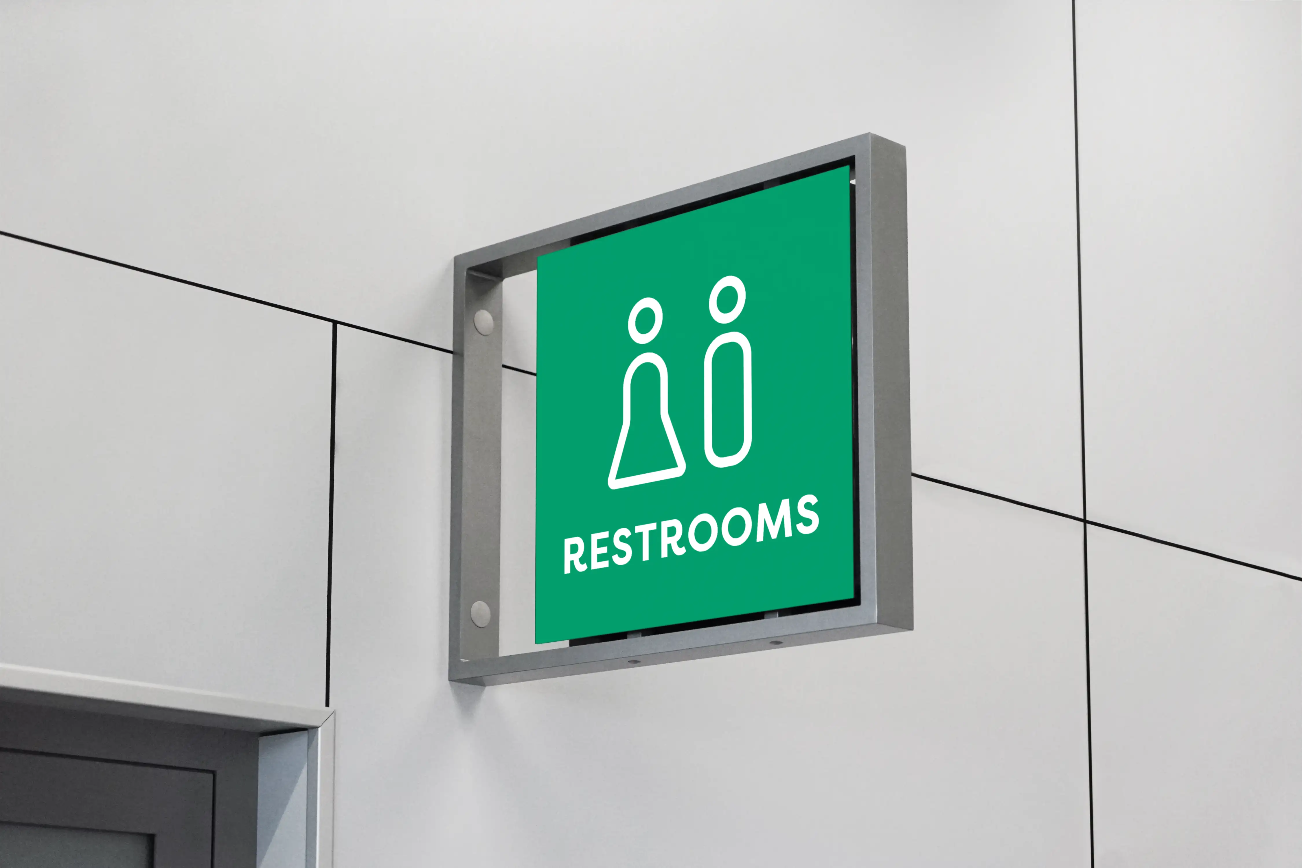
SPL is family-friendly, and we wanted to maintain its warm identity while celebrating the city’s cultural legacy. Saginaw is known for its “Train & Grain” heritage due to its railroads and flour mills. The new logo pays homage to this by combining a wheat stalk with a bookmark. A humanist sans serif typeface and vibrant color scheme enhance Saginaw’s vivacious personality. Pictograms made from the logo can be used across wayfinding systems.
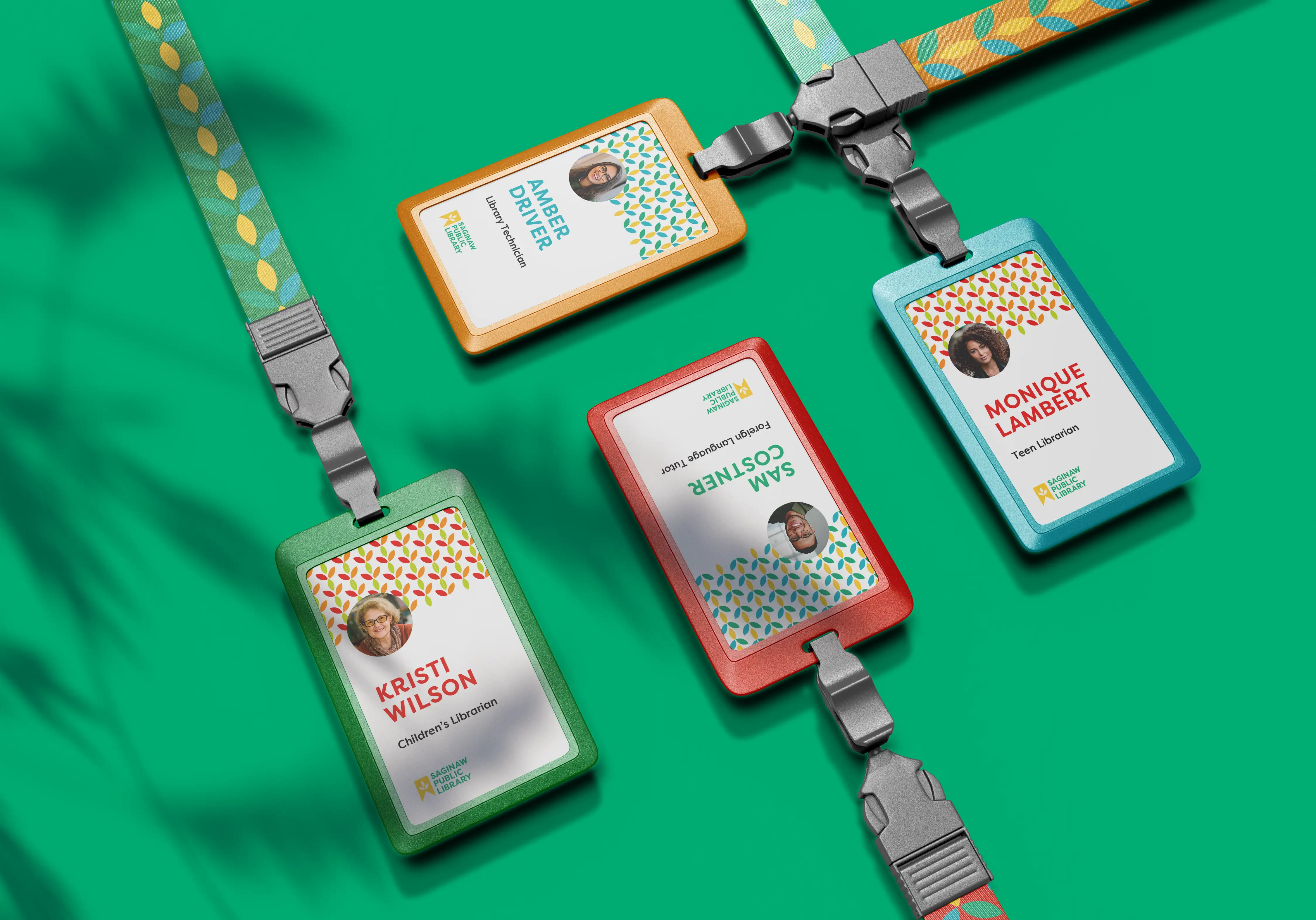
Redesigned library cards will also help patrons start often-dreaded small talk. Love mystery thrillers? Show it off on your card! The cards will be compact and can be personalized to display the reader’s interests.
A Step in the Right Direction
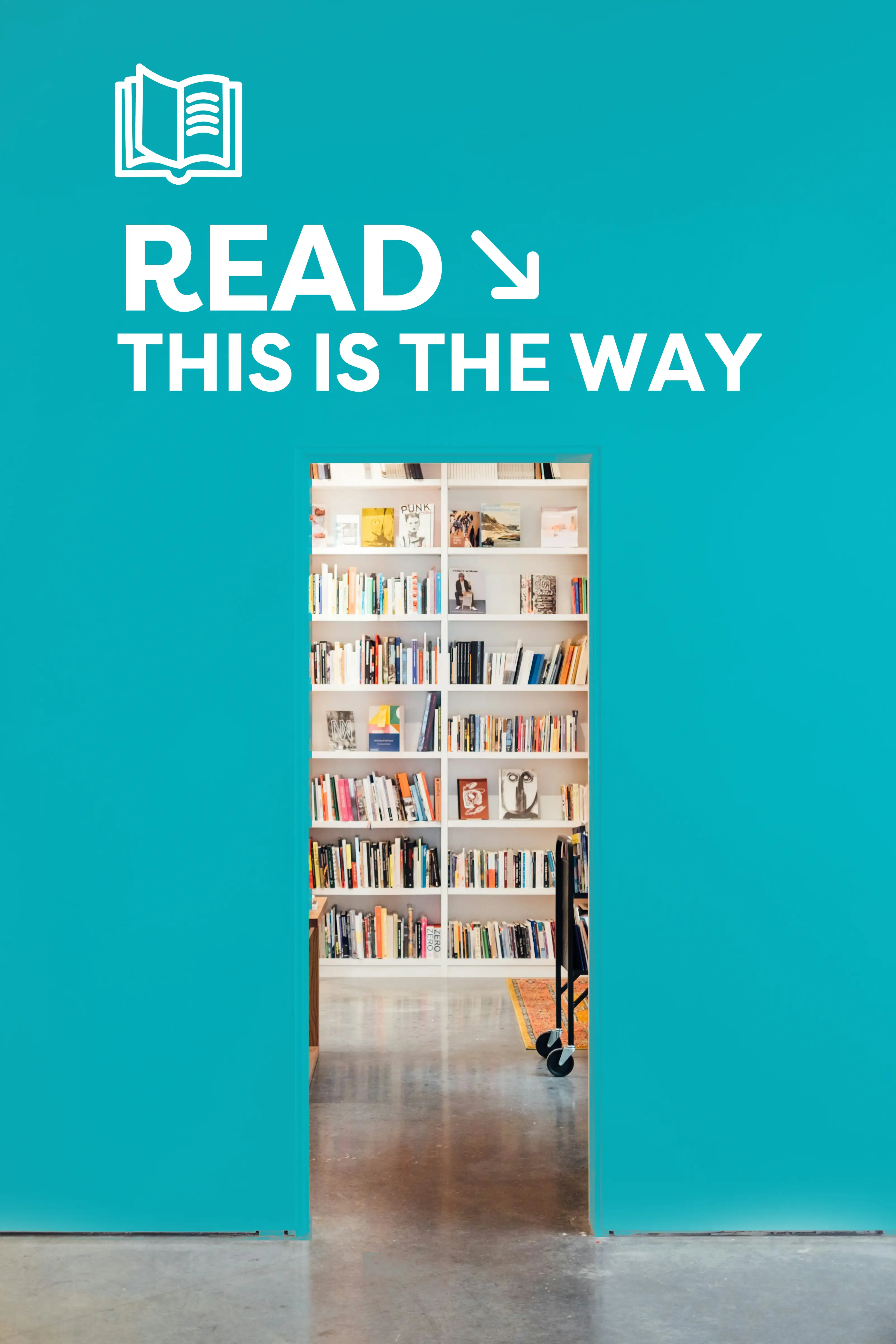
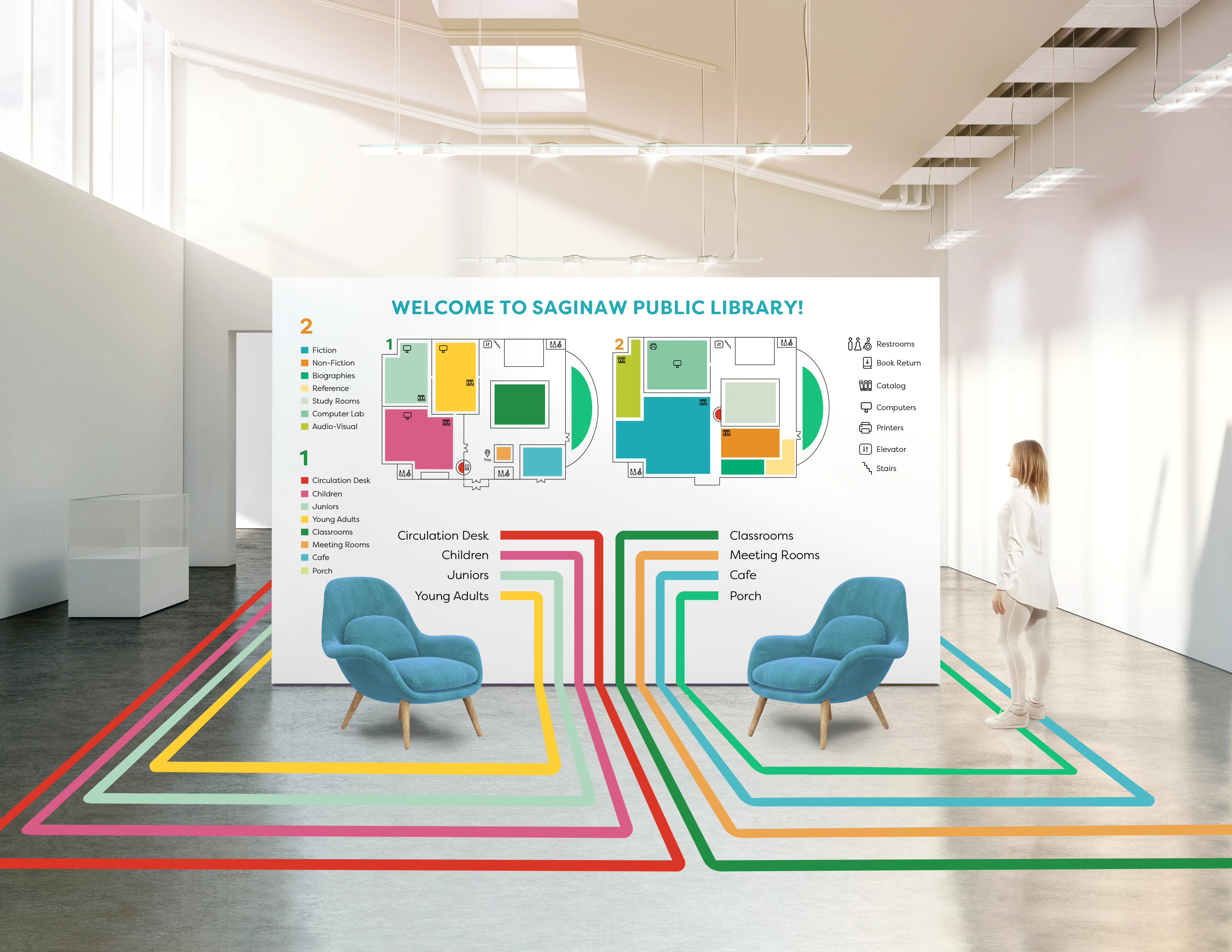
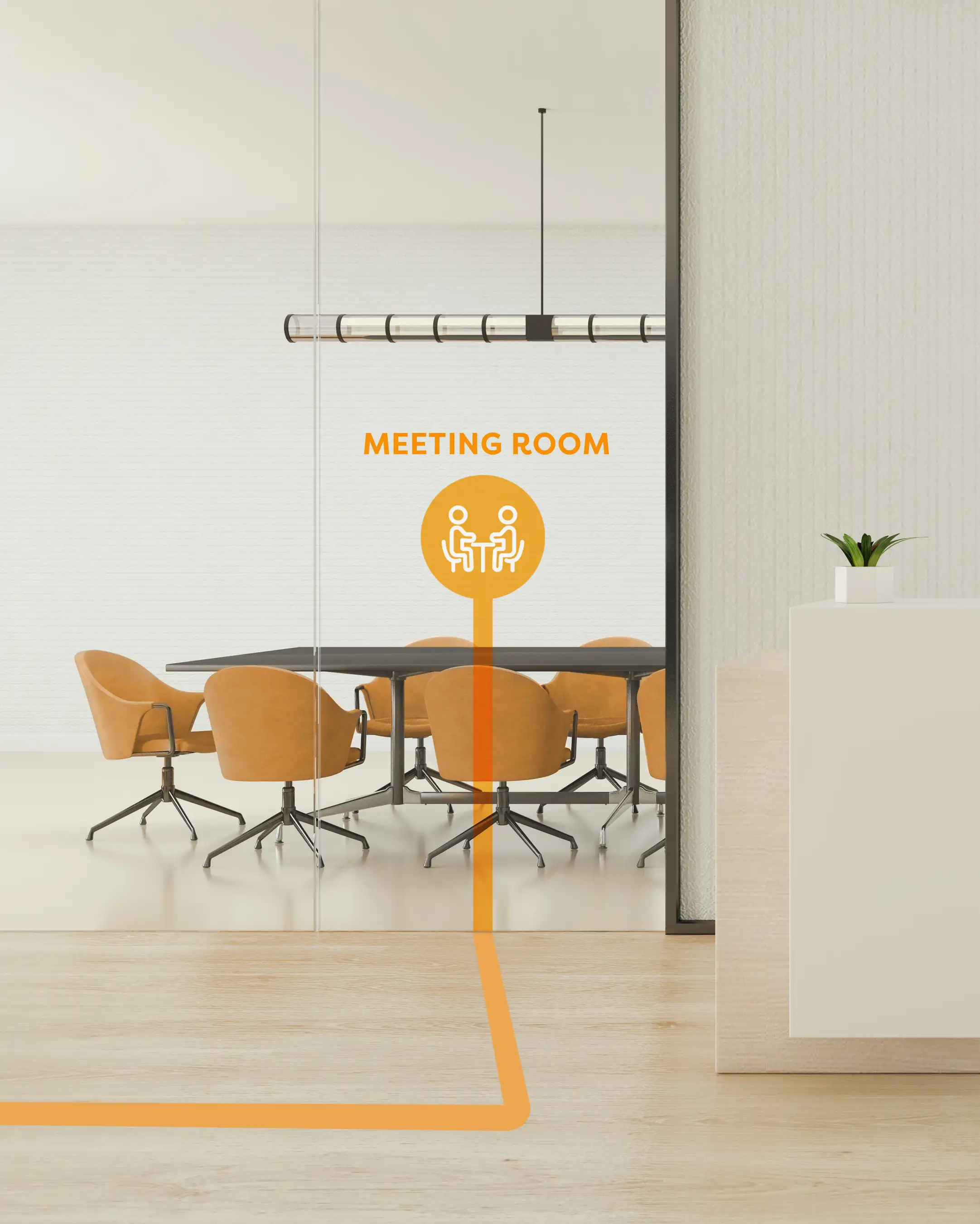
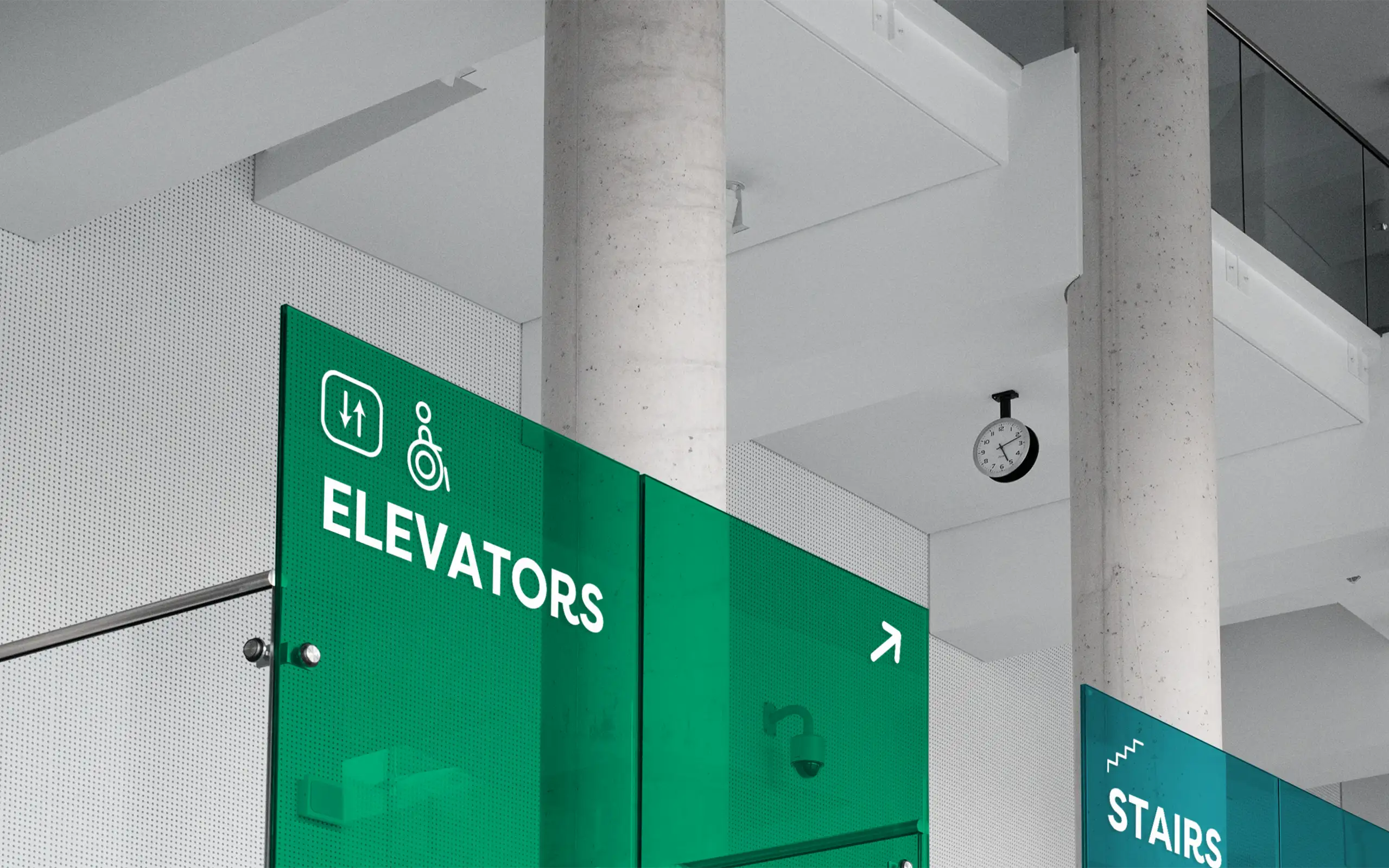
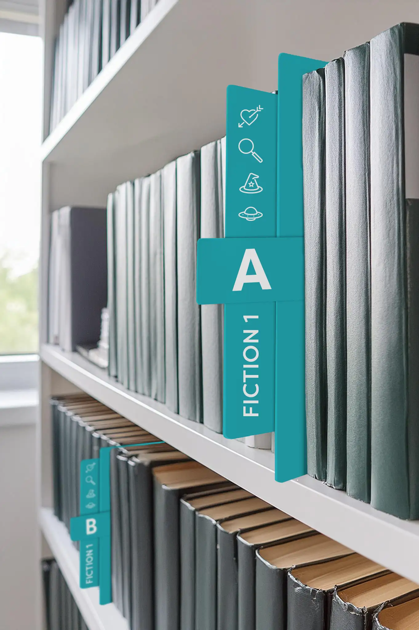
The new wayfinding system will be fun and interactive, using a color-coded wall map and navigation trails to guide patrons to their destinations. Signage will coordinate with the primary wall map and feature icons alongside room or section labels. Bookshelves, shelf dividers, and book tags will also use this color-coded system for consistency and visual recall. This colorful system will be engaging, especially for the young children who are regular visitors to SPL.
Look It Up
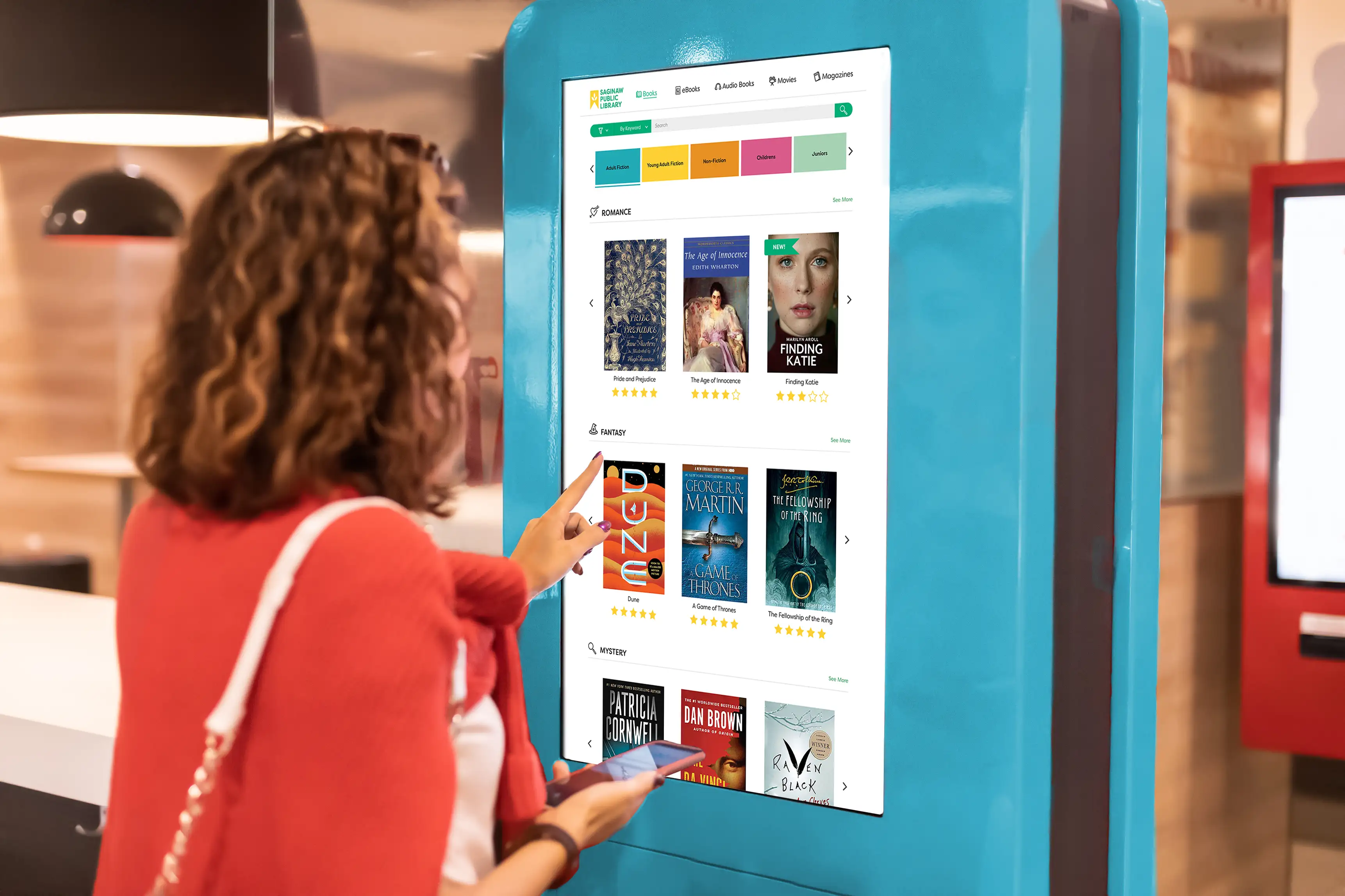
The refined catalog system will feature free-standing touchscreen kiosks in each section, dedicated to SPL’s resources. The interface will include section color-coding, shelf locations, and numbers, genre icons, and call numbers, making it easy to locate items. The revamped interface will also show when books are on the shelf, how many copies are available, and the waitlist for each title. Together, all of SPL’s redesigned touchpoints create an intuitive experience for the library user.
